There’s a common misconception that neutral means boring. It doesn’t.
A well-built neutral composition can be sophisticated, sensory, and memorable.
When a visual scene is grounded in a solid foundation: light, proportions, materiality, and rhythm; you can later introduce trend-driven accents without compromising the overall integrity of the space.
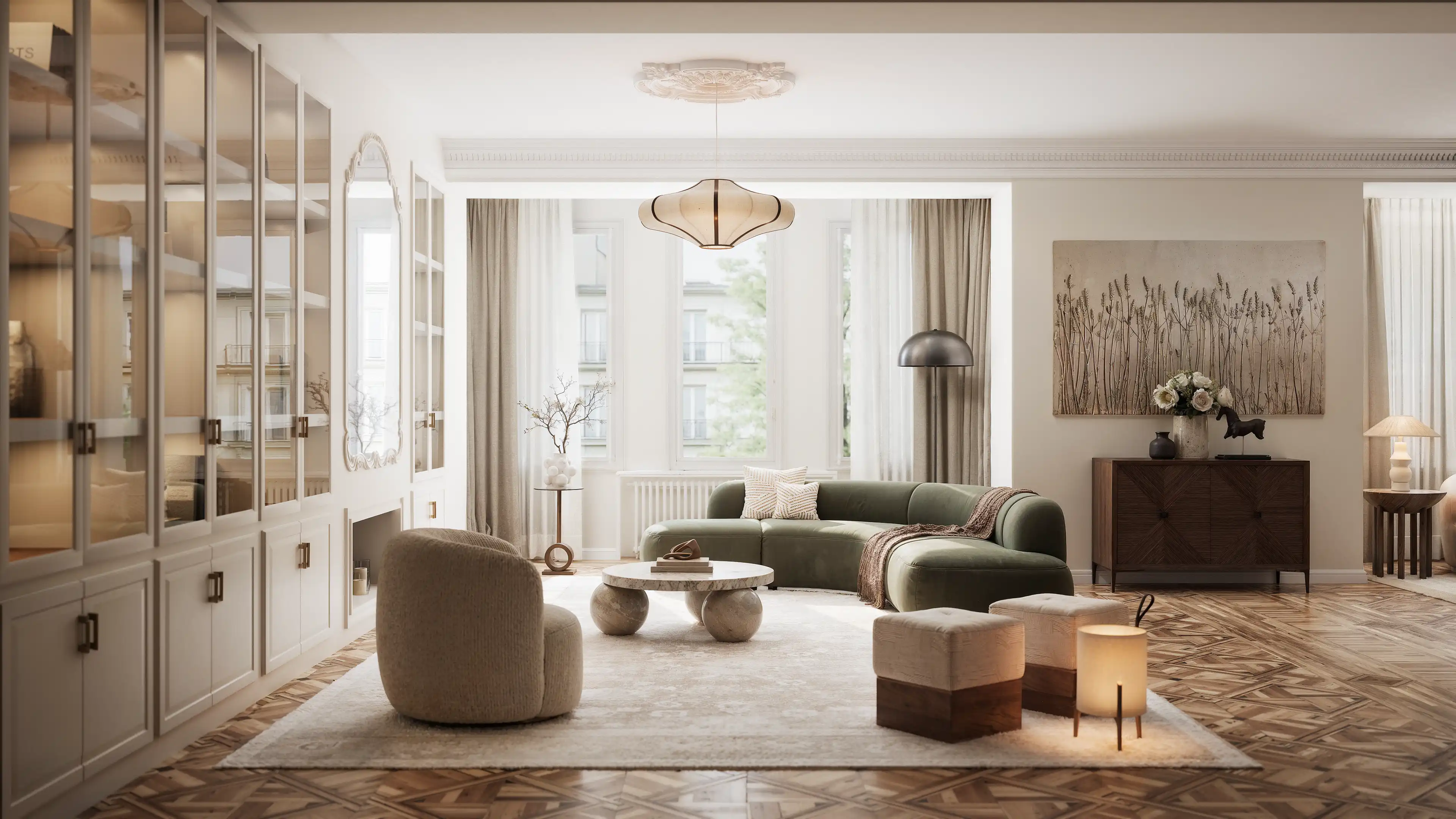
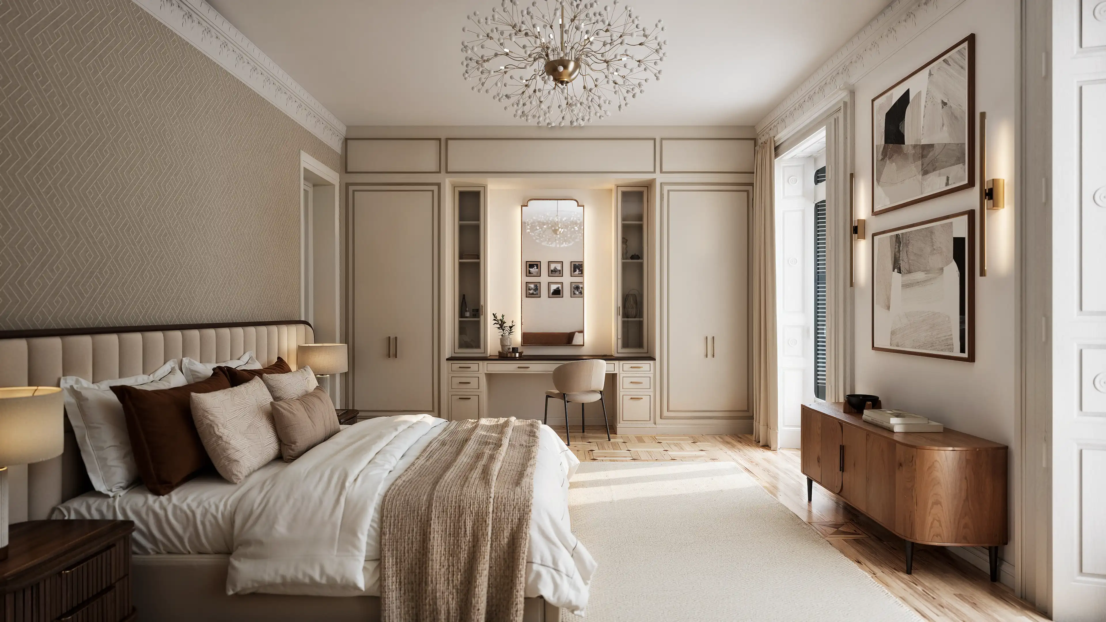
A clear example of this balance can be found in Alcalá, an interior renovation project where classical references and contemporary design decisions coexist naturally.
The proposal is rooted in a strong architectural identity, original mouldings, proportions, and structural elements, while embracing a serene aesthetic built around warm materials, carefully controlled natural light, soft textures, and a well-balanced neutral palette.
In projects like this, choosing a calm visual language is not a conservative move, it is a deliberate one.
It allows the space to communicate character, elegance, and coherence without relying on overly expressive or short-lived design gestures.
Many of today’s emerging design trends point in this same direction: tactile surfaces, warm tones, and more livable, human-centered interiors.
But the real value lies not in copying a specific look, but in understanding why it works, and how to adapt it meaningfully to each project’s context.
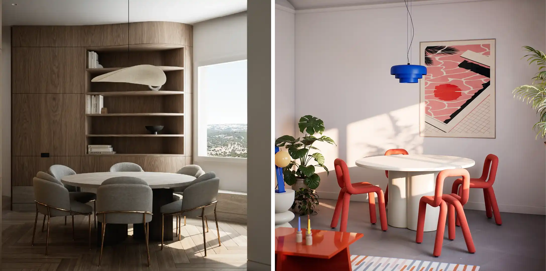
Not every visual we create starts with a client brief.
Some are born from curiosity, the need to explore a style, a material, or an atmosphere freely, with no constraints.
These creative explorations often lead to some of the most visually striking results:
organic shapes, strong contrast, bold color palettes, tactile textures, nostalgic references, or unexpected style blends that aim more for emotion than for balance.
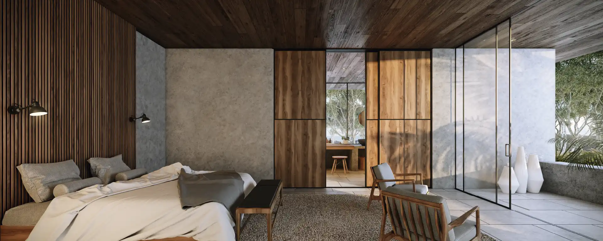
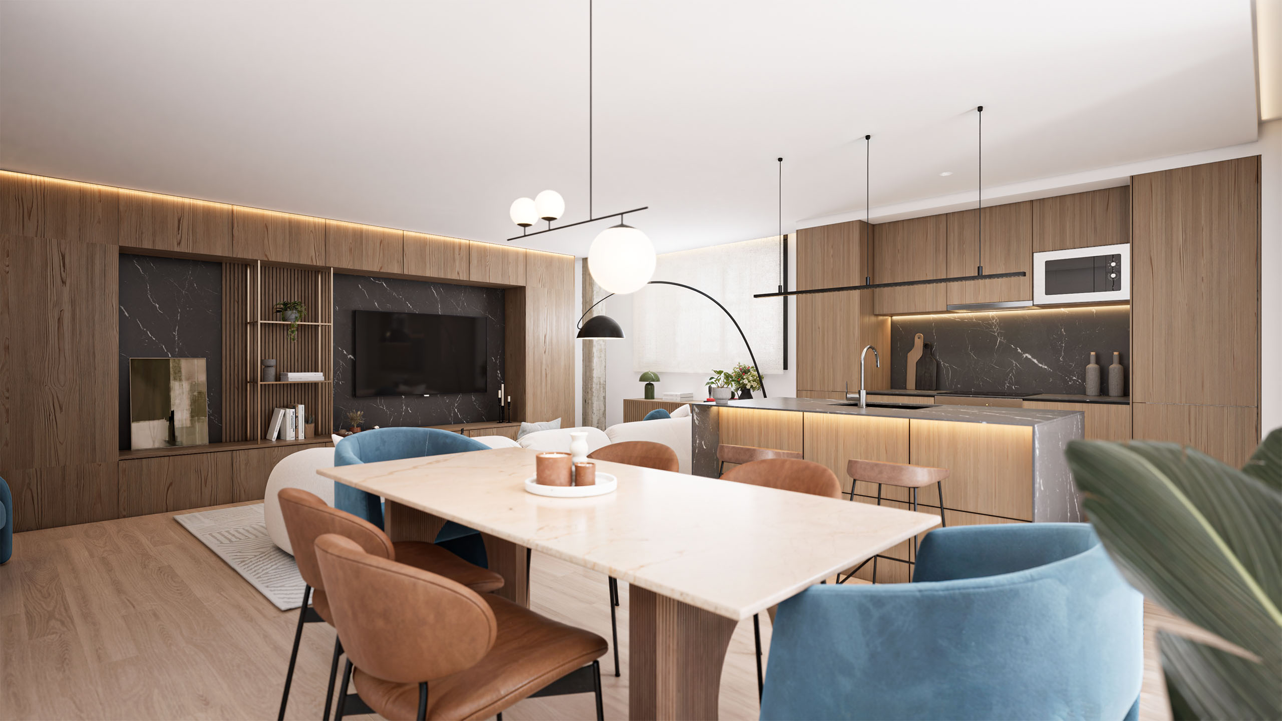
In one of our experimental scenes, the goal was to capture a Mediterranean feeling: textured plaster walls, earthy terracotta tones, soft curves, dense fabrics, and warm, almost cinematic lighting.
The result was immersive and highly current, very much in line with contemporary visual trends.
But it also taught us something valuable:
when a trend-driven aesthetic dominates the entire composition, the margin for error becomes much smaller.
Every mismatch is amplified. If the design doesn’t breathe, the space overwhelms.
That’s why these kinds of styles work beautifully as accents, but demand greater control when used as a foundation.
When a trend inspires you, the challenge isn’t using it, it’s knowing how and where to apply it without compromising the design’s balance.
Here’s a simple guide to help make more intentional choices:
Before thinking in terms of style, think in terms of feeling:
Calm, energy, luxury, warmth, intimacy, familiarity…
Trends make the most impact when they reinforce the emotional tone of a space, not when they contradict it.
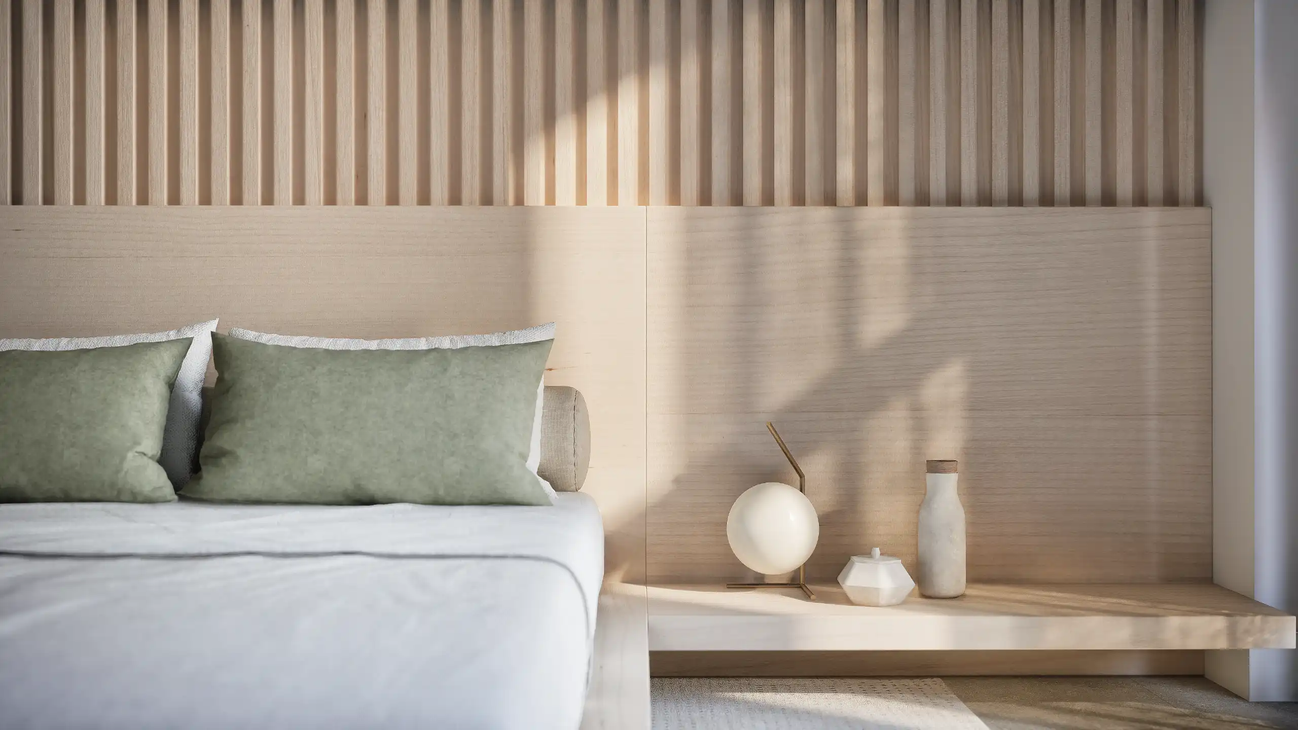
Design works best in layers, not all at once:
This layered approach is especially useful with 2026 design trends focused on sensory elements—tactile surfaces, warm palettes, organic shapes.
You can include them without letting the trend define the entire project.
If a trend is there just to “look current,” it usually shows.
But when it’s thoughtfully placed, it adds authenticity.
A visual trend with no intent will clash.
A subtle gesture, well integrated, can elevate the whole space.
Design now lives as much in screen as in space.
A room can be comfortable but flat on camera, or visually striking but incoherent in real life.
When you work with 3D visualization, renders, or presentations, always ask:
Does this trend improve the visual clarity of the space or just add noise?
Trends are not the enemy. They’re part of the visual language of the present.
But a project shouldn’t be designed for the algorithm, it should be designed to last, to feel right, and to tell a story.
When a trend is applied with intention, the space feels fresh and relevant.
When it’s imposed without thought, the space wears a costume, and costumes age fast.
If you're working on a project and want to explore how to integrate current references without losing coherence, we can help you visualize options and test design decisions before execution.
Explore our services or get in touch if you'd like to talk it through.